The color of the facades is like a dress reflecting the character of the building and to some extent, it is the signature of the architect. The choice of colors on the exterior facades has been an important issue in terms of aesthetic concern and psychological effects, as well as physical and environmental effects.
Objects absorb some of the colors and reflect some of them due to their structure. Color is created by the reflection of light from the objects. The reflected light in a certain range of the wavelength is interpreted as a color in the human brain. The human brain can interpret wavelengths between approximately 700 nanometers and 400 nanometers as color, from red to purple, respectively. Among larger wavelengths infrared, microwave, and radio waves, and among smaller wavelengths ultraviolet, x-rays and gamma rays are not "seen" by our brain in any way, although they surround us in daily life. Objects reflecting most of the light appear light colored and absorbing most of the light appear dark colored. The object looks white when all of the light is reflected, and black when all of it is absorbed.
Colors have been classified according to their psychological effects as warm and cool colors. Warm colors like red, orange, and yellow have larger wavelengths whereas cool colors such as green, blue and purple have smaller wavelengths. In general, warm colors have positive energetic impacts and create good results on interior and exterior facades whereas the cool colors evoke peace and quiet, shaping the purpose of use of the building / living area with these relaxing effects on the interior and exterior facades. Thanks to the use of pigments, the color has become a feature that can be controlled by humans and has created unlimited possibilities for architects on the facades. Due to their psychological effects, the choice of colors on the facades is an important issue to be considered since it has direct effects on the mood of the masses.
In addition to its psychological effects, dark tones of color absorb much of the light and consequently more energy than light ones, and thus the object warms up. Considering the geography of the building, the color chosen for its facade is a factor that can reduce heating / cooling and thermal insulation costs.
According to a survey, white and gray tones are chosen the most in Turkey's exterior facades, while the interior facades mostly have small touches of different colors and textures in addition to white and gray tones. The survey results indicate that white, gray, blue and pink tones are more predominant on exterior facades in the western part of Turkey while in the eastern region mostly have red and brown tones in addition to white and gray. On the interior, white, red, gray and light brown tones predominate in the west, while in the east, light purple and blue tones are used in addition to gray and light brown. This data is very valuable in terms of interpreting human behaviors and moods according to the regions.
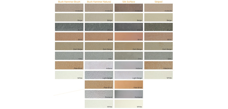
While the CBOARD Panel and Decorative product groups can be painted with an appropriate paint of the desired color on interior and exterior facades, CBOARD Mare Facade Panels can be manufactured in 11 standard colors and 4 standard textures with their unique natural stone appearance. If desired, custom colors can be manufactured giving your facade a unique look. You can find the standard color and texture chart of CBOARD Mare below.
